By Bill Gardner
These are austere times, but the logos recently loaded onto LogoLounge.com - nearly 35,000 since 2008 - certainly do not reflect it. And that is how it should continue to be. Wary homage may be paid to marketing in lean times, but not to identity design. This are two wholly different efforts with different goals. It should set a long-term course for clients, not fall into pits carved out by economic phases.
The most recent uploads to the site still have a vibrancy of color and energy that bucks what in past years might have been considered proper corporate behavior. They set a very optimistic course.
This seventh annual trend report, as always, is as much a forecast as it is a study of the past 12 months. The past informs the future, and the recent past has such momentum that designers would be well-advised to stay this course, even when clients are only maintaining the brands they have, not creating new ones. Business may be slow, but it does not have to be dull.
In preparation for the fifth LogoLounge book, we studied and organized thousands upon thousands of new designs. As always, it's exciting to see new directions emerging. These lead to even newer meanders and connections.
One such direction is that the use of type and text is clearly more critical. Words carry a more concise message. They convey specific rather than generic information.
The increased use of text in identity design takes several forms. A designer may choose to create a wordmark, but also include the mission statement or tagline in the design. Or, he may fill a shape or symbols with more words. People are busy; money is tight. Logos must be interpreted, and interpretation takes time. Words deliver their message immediately.
Another clear direction is the increased chroma of color. Everywhere, there is a brave use of hue, even in the most unexpected places, such as in the identities of very large and conservative clients.
There's another very small item on the horizon that may have a gigantic effect on logo design in the future. When Google introduced its new favicon at the start of 2009, it was a very visible reminder of how powerful that tiny piece of real estate really is. The favicon may turn out to be a measuring stick against which the success of any new logo design might be measured - as in, can this logo be made to fit in a 15 x 15-pixel square?
The 15 trends that follow are not instructions, rules or indeed any finite accounting of all of the logo trends currently in motion. Many trends shared in previous reports are indeed still in motion.
These trends are offered as an objective report of the newest, most relevant directions. They should serve as traction in moving you forward in identity design. Revisit the full collection of the past six years' worth of trends reports at LogoLounge.com for even more context.
PhotoFill
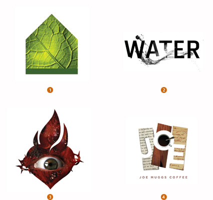
Photography is in no way new to visual branding, although traditionally images of this nature were iconic shots of a subject or a scene. Photo images have now partnered up and been hybridized with vector based images to create a new genre.
Technologically, this was an impractical union in years past. But the challenges of complicating an identity with a halftone image have for the most part now been put to rest. If AT&T and UPS can survive in the atmosphere of a halftone world, then why can't the rest of us breathe the same air?
Often the photo serves as a background or fill in a graphic icon, though some examples have vector elements that merge into the halftone image. Think about logos that for years have been pumped full with graphic pattern. This is just a different fuel-a photo-with a higher octane.
1. El Paso, Galeria de Comunicacion, Lazar Greenhouses 2. TOKY Branding+Design, The Pulitzer Foundation for the Arts 3. APSITS, DIESEL 4. Big Communications, Joe Muggs Coffee
Concealed
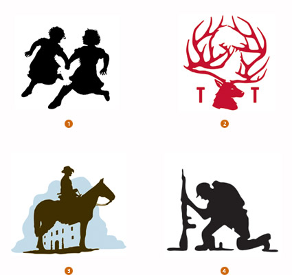
Every generation has its own find-the-hidden-image puzzle, whether it's Highlights Magazine or "Where's Waldo?". There is a certain fascination and visceral excitement when the viewer suddenly finds an image he has been staring at for hours. Once you've found it, you can't wipe your mind clean of it. This aha! moment is what creates the sense of ownership for the anyone who discovers the hidden level of meaning in any logo.
Ronald J. Cala II has developed a reputation for crafting compelling silhouette images such as the two young girls running hand-in-hand, a white dove formed by their clasped hands. Or Duffy Partners' hidden gander and bass in the Tall Tales Cafe identity for Gander Mountain. Years ago, FedEx discovered that the hidden arrow in its logo caused consumers to become evangelical in pointing out the hidden imagery to others.
1. Calacampania Studios, Calagraphic Design 2. Duffy & Partners, Gander Mountain 3. The Bradfor Lawton Design Group, REOC 4. Felixsockwell.com, New York Times
VariDot
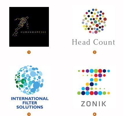
Spotting a logo composed of dots has never been an issue: There is no lack of marks that contain dots in rows or grids, or that blanket an image with a Benday halftone pattern. Finding a trend here means identifying dots with unique characteristics and understanding why they are carrying on the way they are. Last year's Colorblind trend was easy to spot, but hard to explain. It may well have served as a launching point for this year's trend.
Note that the dots in these logos rely on a high degree of randomness. They seem to revel in a lack of consistency of size or color. As opposed to previous years where the spots marched with conformity, these logos glorify individuality. But at the same time they still rely on linkage to create shape. Let the dots be roommates, just not good friends.
1. Alin Golfitescu, www.humanware360.com 2. Thread Design, Head Count Asia 3. Blue Sky Design, International Filter Solutions 4. Lippincott, Zonik
Candy Stripe
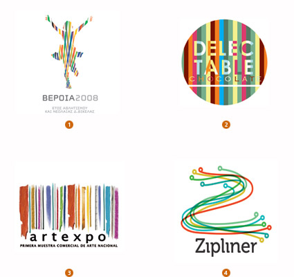
Like a stack of candy Necco Wafers or a row of crayons pushed together in no particular order, this trend has the scent of a fond childhood memory. Something playful and not terribly serious is taking place here. Multi-colored ribbons in broad hues are laid together to create a field that is highly vivid but which in no way approximates the orderly nature of a rainbow.
High chroma stripes serve as the backdrop, inserted in a vector-based silhouette, or they stand on their own as a cohesive group with a like mind and message. This riot of color seems to tweak its nose at the idea of a corporate color. Diversity reigns here. This is an all-out celebration of plurality, whether as an inspired political statement or just to promote a restaurant's highly varied menu.
1. ORFIK DESIGN, DVA SA 2. Liquid Pixel Studio, Delectable Chocolate 3. juancazu, camara de comercio de bogota 4.dache, Zipliner
Texting
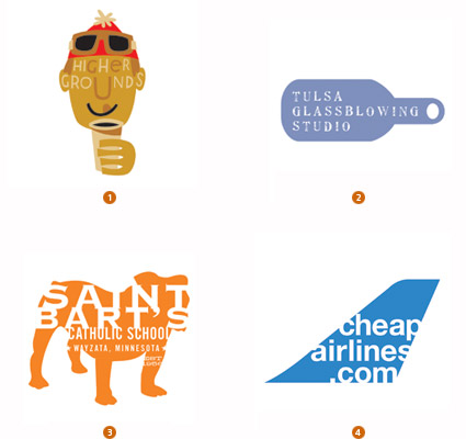
Text and icon combined effectively in a lock-up are nothing new. But now there's a new breed afoot. A rash of logos have been launched with not only the name of an organization but at times, the mission statement, tag line, and even location knocked out of the background.
This simplified solution can make for an economy of space, but it can also create some challenges of scale. If the design is displayed large enough to read the type, will the icon become too horsy? If the icon is kept to appropriate scale, will the type disappear?
Copy is playing an even more important role than ever in several trends this year. There is a pleasant simplicity of message here that evokes an honest nature that borders on naive in a good way.
1. Chris Rooney Illustration/Design, Heavenly Ski Resort 2. Bryan Cooper Design, Tulsa Glassblowing Studio 3.Sussner Design Company, saint barts 4. GDNSS, cheapairlines.com
Encrust
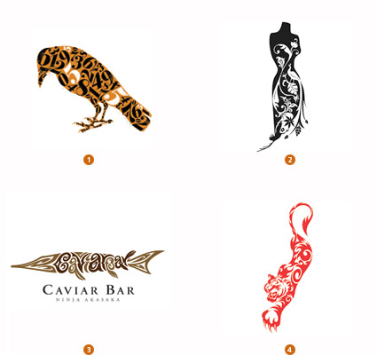
"One of something ugly is ugly. Many of something ugly is beautiful." This long-standing design adage comes to life with this trend. Sometimes you can max out embellishment to the point where the viewer is simply stupefied. These marks certainly grab the consumer's eye with purposeful and symbolic texture that helps to finish the punch line of the logo.
Scale is critical to the success of this trend. Too small and textural messages will vanish, regardless of beauty. These are not filled with a traditional pattern but are often illustrated with a unique visual message that gives context and dimension to the shape. The eye can tell there is more than one layer to these marks and that always assures the second look.
1. Mattson Creative, Career Artist Management 2. cogu design, Yvonne Coutinho 3. Graphics & Designing Inc., MTK 4. Jobi, Sam and Shahir Ahmed
Monolgue
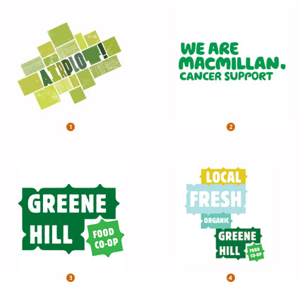
Words have new roles here, redefined as visuals that swim in neck-to-neck competition for consumers' attention. When Landor redefined the YWCA logo four years ago, mission took top billing over the organization' name and the whole affair was crafted from an inauspicious Helvetica with no adornment.
Powerful words carry great weight. When a democratic graphic vehicle can be used to allow the professionals and the layperson to create from the same system, the odds of the message effectively reaching the public are multiplied. Think of these systems as a series of parts and pieces designed to interlink in a relatively effortless manner. This unassuming solution removes the hands off nature that could thwart progress, especially in a public movement.
1. Airside, Airplot 2. Wolff Olins, Macmillan Cancer Support 3. Base, Greene Hill Food Co-op 4. Base, Greene Hill Food Co-op, Lockup Variation
Doily
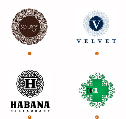
Logos served up on a lace doily like delicate confections are the most recent variant on precious embellishment and floral tracery that have been sited in trends from years past. The fine fretwork serves to create a gentle cocoon around a typically hard graphic center. The core is usually a letter form or symbol, kept straightforward with an encapsulating explosion of silhouette lace.
The dichotomy of harsh and fine balance the message of a solid entity with an approachable personality. Though this is an extension of previous trends which also expressed human tenderness and fragility, the continued use of these dainty silhouette is growing thin. The difference here seems to be the marriage between geometric pattern and organic embellishment.
1. Iperdesign, Inc., splurge dessert 2. R&R Partners, Harrah's 3. Diagram, Eligiuz 4. Gesture Studio, Isaias Gil
Flip Flop
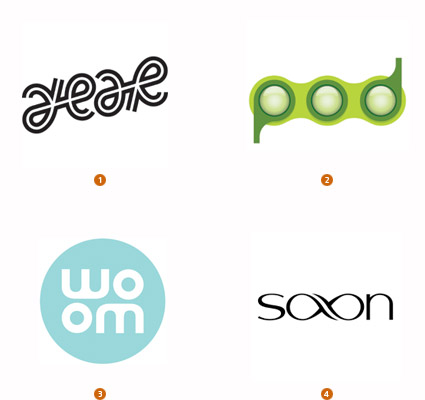
In a year with the cinematic release of Dan Brown's "Angels and Demons." expect an expanded appreciation and interest in inversion solutions. The veteran designer John Langdon was contacted by the author and commissioned to create art for several words that would read the same right side up or upside down. This art was key to the storyline, and the bestseller has reintroduced this concept to the public.
There is an indefinable magic that occurs when a consumer sees art that only has to make half a rotation to apparently return to its point of origin. Some of these solutions work with a mirrored reflection, while others are only partial inversions. Whichever way they are designed, that rotating axis becomes the device that creates participation by the consumer and that builds an affinity with the brand.
1. MINE, Scheyer/SF 2. Pearson Education Ltd, Pearson Education 3. NOT A CANNED HAM, Graco 4. Roy Smith Design, Shaun Saxon Photography
Mosaic
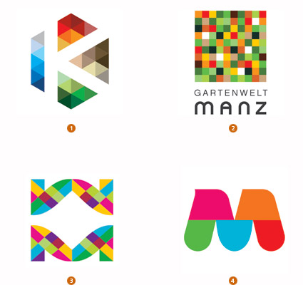
E pluribus unum: "Out of many, one." This motto helps define these brilliant color mosaics. They are like a roomful of diverse pixels pushed together so tightly that there is no room for a line of division. Adjacent colors simply merge together at their shared borders to fill a shape that helps define the visual message. Traditionally a problem for any logo that anticipated living in a black and white application, this challenge becomes a point of celebration.
Not so many years ago, in 2003, Altria's multi-colored square grid logo broke ground for this trend. At the time, much was made of the designs inability to be cost-effectively reproduced in diverse print applications. Technology changes and the increased importance of an RGB environment for many companies has led to a reevaluation of reproduction concerns and a resurgence of this concept.
1. Team Y&R, Khalid Bin Haider Group 2. Kommunikation & Design, Gartenwelt Manz 3. dache, webmynd 4. NATIONAL Public Relations, Greater Montreal
Sequential
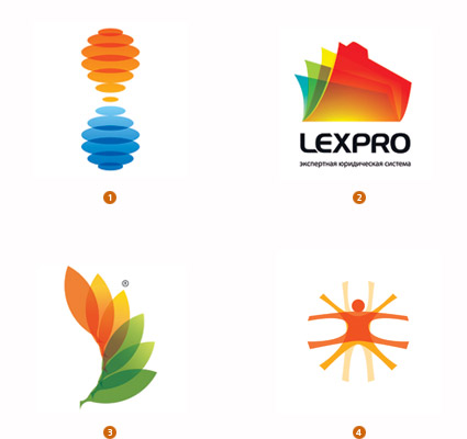
Economies, governments, and individuals continue to call for "greater transparency" in society. No longer a cry limited to the financial sector, industry is Bristol-scrubbing themselves and their products in preparation for full-body inspections. Though this is not a literal request for visual transparency, for several years, designers have taken liberties with the concept to deliver metaphoric solutions that consumers understand.
Depicting motion in sequential steps combined with transparency is the latest iteration to branch out from this trend family. Stop-motion pictoral steps created in clear, shifting colors help define process in a single un-animated image. The introduction of sequential color steps help to further define the concept by demonstrating movement: time passage through seasons, temperature shifts, or just a rainbow-colored transition that demonstrates order and harmony, not chaos.
1. Gardner Design, BiTemp 2. RedBrand, LexPro 3. metaforma design, RACE research for an alternative and clean energy 4. Schwartzrock Graphic Arts, Design Center
Recycle
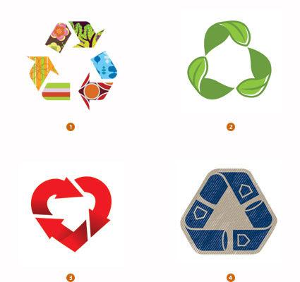
Sustainability is no longer a corporate mantra to appease customers or the public. For a decade or better, companies have professed an allegiance to the cause and made every attempt to keep policy and practice as green as possible. An ever greater segment of associations and industry are emerging with sustainability as the business, not just a byproduct.
The Universal Recycling Symbol, created 40 years ago for the Container Corporation of America, has graced products and corporate literature for years. Slowly these symbols have been on an upward pilgrimage from the bottom of a container to the priciest real estate on the package face.
This three arrow recycled symbol is in the public domain but now has graduated and is being redressed as the logo itself. Design varies as dramatically: The arrows might be filled with pattern relevant to the industry, or the arrows might be replaced with the environmentally conscious product. Reuse of this symbol as a logo proves the designers have truly mastered the art of recycling.
1 .rylander design, Refabric, Inc. 2. Tyme Inc., Office Depot 3. BrandBerry, non-commercial 4. Kevin France Design, Inc., VF corp
Dandelion
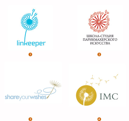
Though you may well curse and despise the dandelion, there is little denying the weed's prodigious ability to propagate. A single dandelion produces hundreds of parachute-wearing seeds just waiting for the slightest wisp of wind to launch a full -scale invasion. Despite understanding the insidious process all too well, who has never picked one of these tantalizing puffballs, blown and launched 100 more weeds.
It is our affinity with this process that makes this iconic symbol a perfect logo solution. The seed ball is visually striking and easily understood, especially with a few rogue parachutes in departure. The process is so analogous to the propagation of an idea that it can't be contained. The single drifting seed embodies the idea that every seed makes it's own unique journey and relies on the will of nature to determine where it will land and grow. Graphically, the ball is so ubiquitous that interpretation can be wide and, by no means, literal: It sells the idea of freedom.
1. Ulyanov Denis, linkeeper 2. RedBrand, Barberschool 3. LaMonica Design, Morningstar Communications 4. Courtney & Company, IMC Group
Circulate
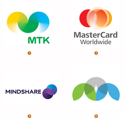
Circles are simply the building blocks and mortar of design. Symbolically, they are the perfect multipurpose icon, representing everything from eternity, the cycle of life, the earth, centering and balance, perfection, the wheel and motion, and whatever else you may need to define. This utility player aspect also detracts from the pure circle: In attempting to mean everything to everyone, it can also mean nothing to anyone.
For these reasons, it is unusual to find the humble circle investigating new visual territory. These circles, however, are focused on the depiction of transition. Whether through the animated cycling of color rotation, as in the Moving Brands solution for MindShare, or as in the static color transition created for MTK, cycles and motion are the given here. But the star of this trend is that the process of evolution does not disturb the revolution.
1. Porkka & Kuutsa Oy, Central Union of Agricultural Producers & Forest Owners 2. FutureBrand, MasterCard Worldwide 3. Moving Brands, Mindshare 4.Gardner Design, PBA Architects
Gossamer
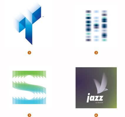
Evolution is perhaps most dramatic when two species jump the barriers and create a new line. Two previous trend categories, Transparent logos and Blur logos, have both been recorded and broken into subsets over the last several years as they have evolved. Here the two merge successfully to demonstrate motion or convey the blending of elements.
Transparency still delivers the dictum that a process is open to the public and nothing is obscured. It also continues to be novel enough to consumers that it plays a pretty important role as eye candy. The blur or out-of-focus edge in these marks works in a similar fashion as an optical illusion that is confrontational to the eye and has to be dealt with.
1. Michael Freimuth Creative, Tone Animation, LLC. 2. Roy Smith Design, Hooke Laboratories 3. Roman Kotikov, Soft cafe 4. Alin Golfitescu, mobilink pakistan
Minor Trends
Some categories emerged this year that did not qualify for their own lanes, but which are still worthy of mention.
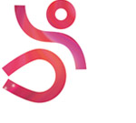 | Peepshow: Halftone imagery is increasingly being used for fill inside of vector images instead of solid color fill. Wrijfhout, Clq.nl - City of Delft |
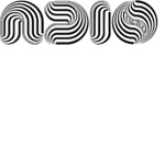 | Psychosis: Another new sort of fill is more psychedelic-crazy lines and patterns projected onto other shapes. Valhalla | Design & Conquer , Adio Shoes |
 | Embroidery: There's plenty of what could be called dotted line or stitching at work. Either approach produces a sense of the hand-made. Squires and Company, Chico's |
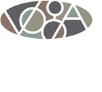 | Stained Glass: Imagine a stained glass window, but turn the lead white: That sort of mosaic of color is taking shape. R&R Partners, Harrah's |
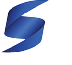 | 3D Curls: We're still seeing plenty of 3-D ribbons, although these are a departure from the "cause" ribbons that have been so prevalent of late. These ribbons take on new forms and shapes, like letters or a complete logo. Gardner Design , Surency |
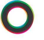 | Color Ring: Think of a series of brightly colored, transparent rings, loosely layered on each other to create porthole of many colors. Martin Jordan , Ministry of Education, Youth and Sports Brandenburg |
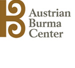 | Celtic: Highly geometric yet handcrafted forms are appearing. Like Celtic letterforms or knots, they have nodules and serifs that are unique and have flourish, but which are also refined. These have a wonderful balance between the manufactured and the man-made. Karl Design Vienna, Burmahlife Austria |
Bill Gardner is principal of Gardner Design and creator of LogoLounge.com, a unique web site where, in real-time, members can post their logo design work; study the work of others; search the database by designer's name, client type, and other attributes; learn from articles and news written expressly for logo designers; and much more. Bill can be contacted at bill@logolounge.com.
2009 Logolounge Inc.
SELENGKAPNYA>>